KILIG Nexa Core
Retail packaging for KILIG’s glass air fryer. One box had to sell a premium appliance, explain a new idea and look good on a kitchen counter.
- Client
- KILIG · True North International
- Role
- Packaging design
- Year
- 2025
- Format
- Retail carton, 478 × 306 × 360 mm

01The product
Nexa Core is a 4 L, 1800 W air fryer with a borosilicate glass basket, a stainless steel tray and heating from both the top and the bottom. It has no Teflon coating, 8 presets built around Indian and global food, and Wi-Fi control through the MyKilig app. It sells at an MRP of ₹19,990, so it competes at the premium end of the shelf.
The box had to carry all of that without becoming a spec sheet.
02The idea
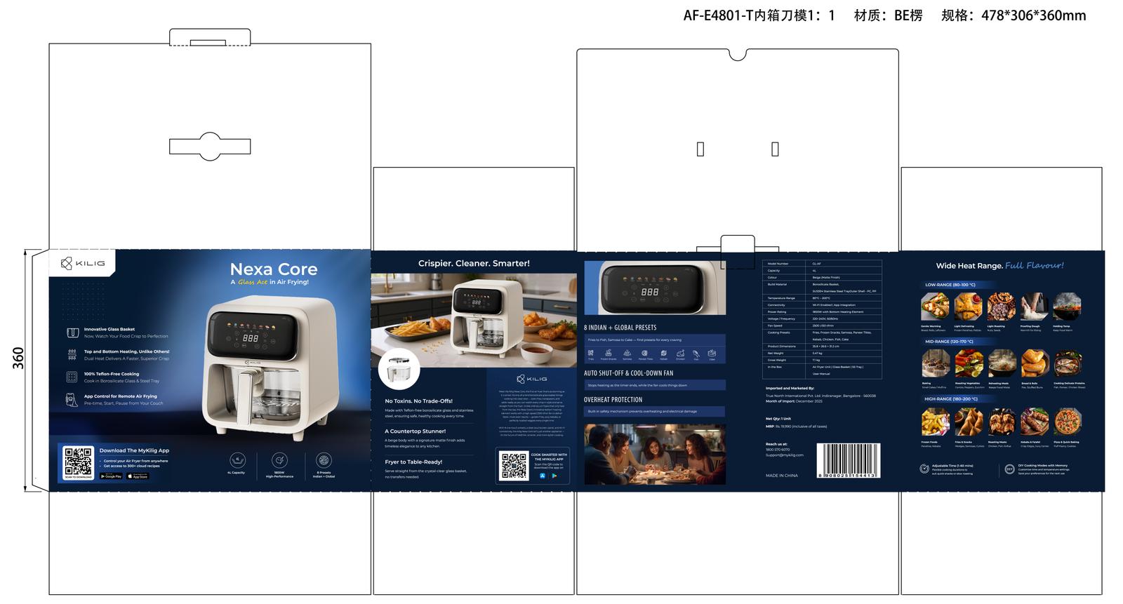
Most air fryer boxes lead with numbers: litres, watts, presets. Nexa Core has something you can actually see: a glass basket. No coating, and you can watch the food crisp. So the box leads with the glass and treats the numbers as supporting proof.
A Glass Act in Air Frying!
03Panel by panel
- Front: one message, then proof
Product name, the “Glass Act” line and a large cut-out of the fryer with the glass basket in view. Four benefit icons run down the left: glass basket, top and bottom heating, 100% Teflon-free cooking, app control. At the bottom are the QR code for the MyKilig app and the three numbers buyers compare: 4 L, 1800 W, 8 presets.
- Side: the lifestyle panel
“Crispier. Cleaner. Smarter!” over a kitchen photo, then three short claims: No Toxins. No Trade-Offs! · A Countertop Stunner! · Fryer to Table-Ready!
- Back: the details
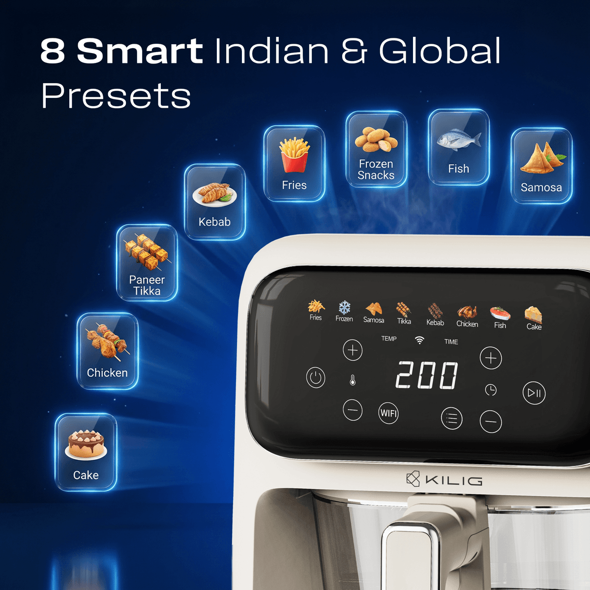
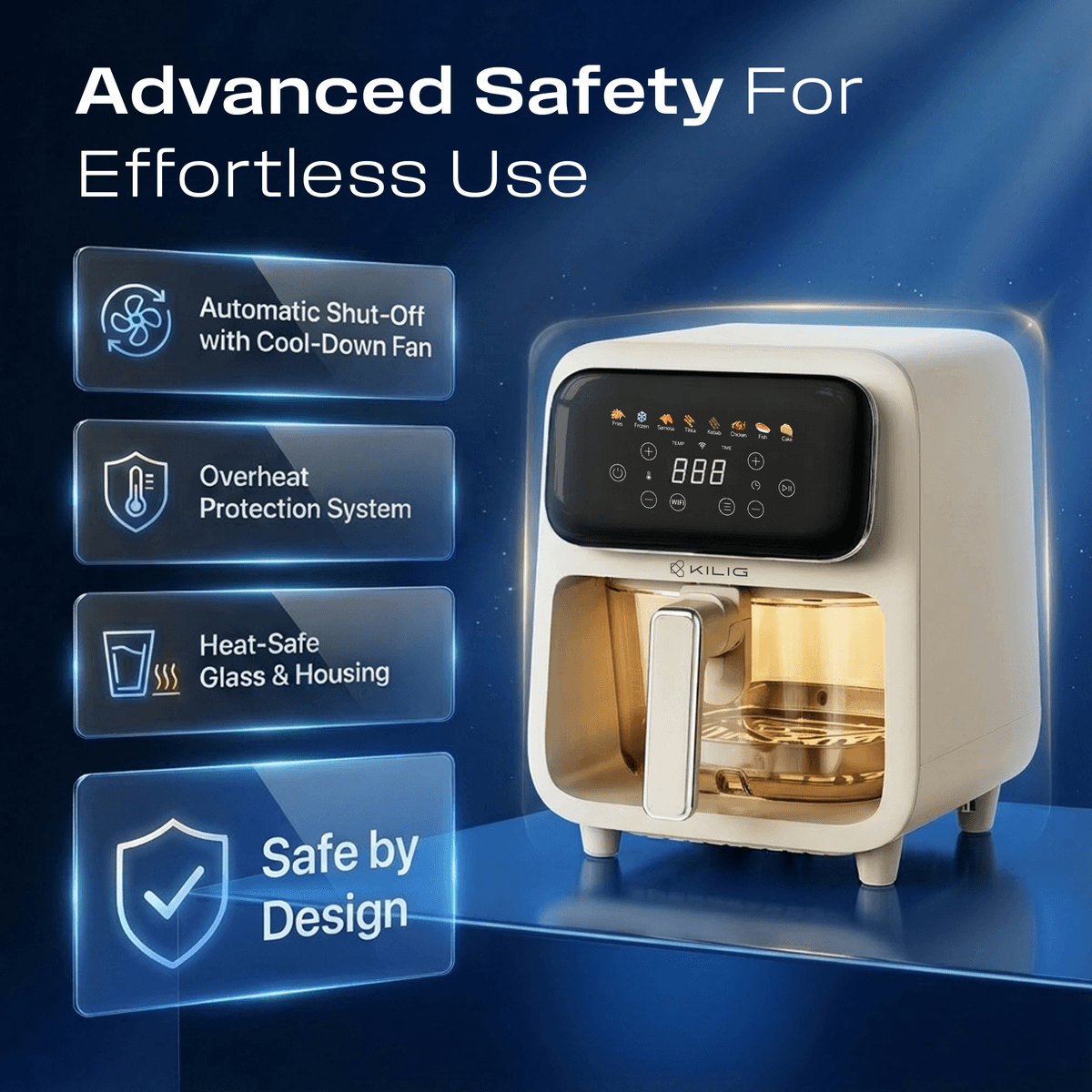
The 8 Indian and global presets as an icon row, auto shut-off and the cool-down fan, overheat protection, then the full spec table, importer details and barcode.
- Side: what you can cook
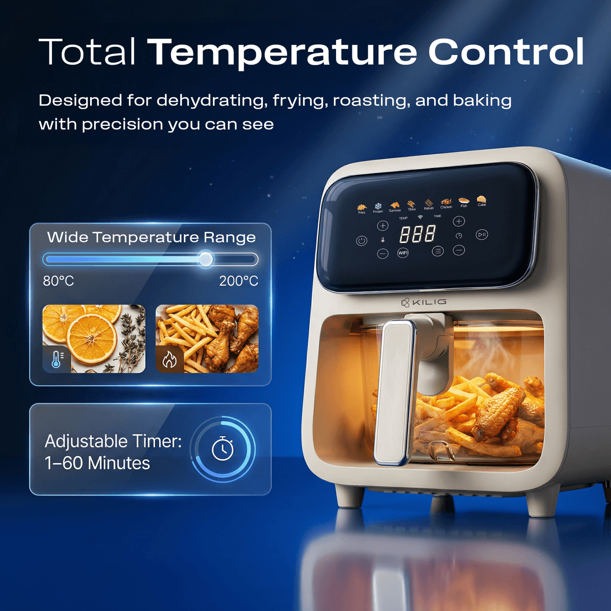
“Wide Heat Range. Full Flavour!” groups real dishes into low, mid and high heat bands, so the temperature range reads as food rather than numbers.
04Design decisions
- Deep navy, cream product
The fryer is a matte beige. A deep blue gradient behind it makes the product the brightest thing on the box and stands apart from the black and white boxes that fill the category.
- One playful note
Everything is set in a clean sans, except “Glass Act” in script. That one line carries the personality. The rest stays calm and readable.
- Built for India
Presets and the heat chart use Indian food first (samosa, paneer tikka, kebab) alongside fries, chicken, fish and cake.
- The box leads to the app
QR codes on the front and side link to the MyKilig app, so the box starts the setup.


05The Amazon listing
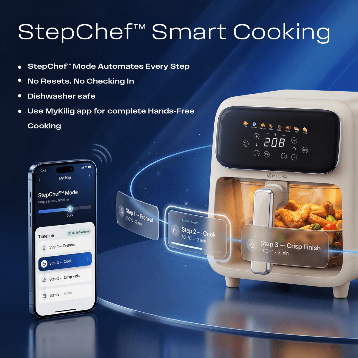
I also designed the product’s Amazon listing images. Shoppers swipe through them on a phone in a few seconds, so each image makes one point, in the order a buyer’s questions come up: why glass, how it heats, what it cooks, is it safe, how hot it goes, how smart it is.
Headlines are short and set large so they read at thumbnail size, and the listing uses the same deep navy and cream as the box, so the images online and the box at the door look like one product.
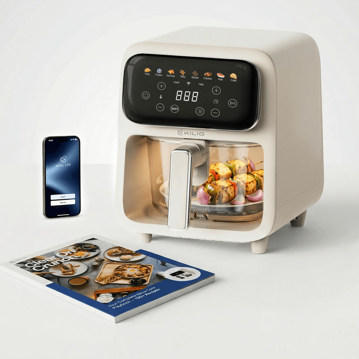
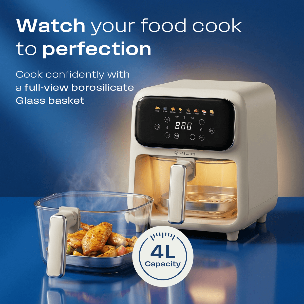
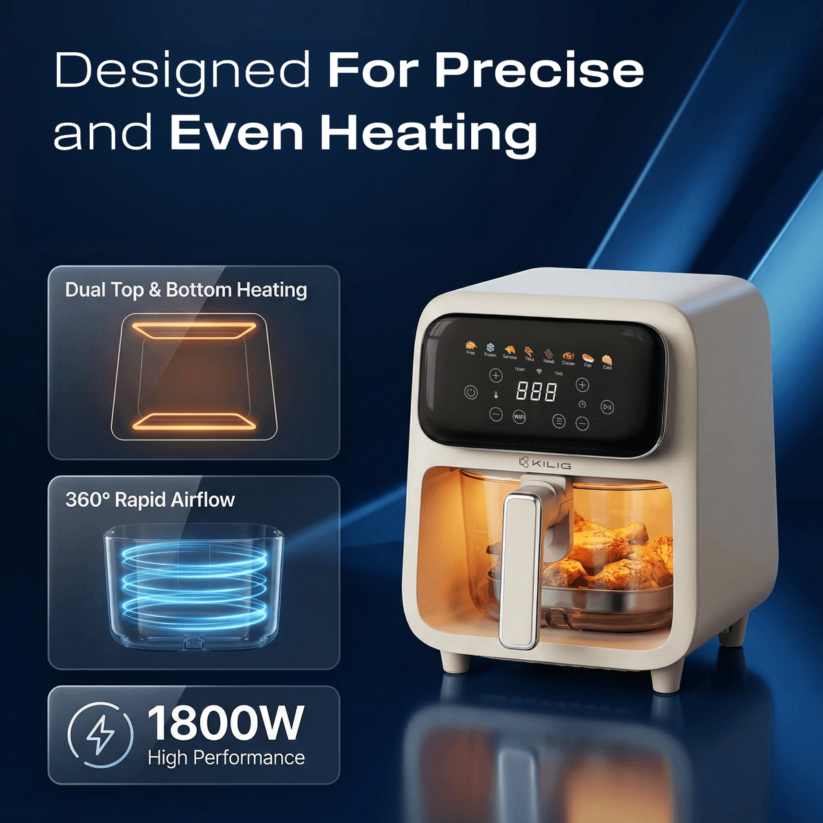
Real client project for KILIG (True North International). The packaging artwork and dieline are my work. The in-context photos on this page are mockups I generated with GPT Image 2.0 (via Higgsfield) from the final dieline.
Next project →Ooru