Ooru
A filter-coffee brand that tastes like home: a Bengaluru coffee identity built from the steel tumbler on every darshini counter.
- Role
- Brand identity, art direction
- Scope
- Logo, palette, type, pattern, packaging, signage, social
- Year
- 2026
- Tools
- Illustrator · Figma · GPT Image 2.0
01The brief
Bengaluru runs on filter coffee, but packaged filter coffee looks like one of two things: dusty heritage labels or imported third-wave minimalism. Neither feels like the darshini down the road.
The self-set brief: build a D2C filter-coffee brand that feels local, warm and modern, and works everywhere from a 16 px favicon to a street kiosk.
02The insight
The ritual is the brand. Every South Indian knows the pour: decoction, milk, then coffee poured from a height between the davara and the tumbler until it froths.
“Ooru” means home town. The brand had to taste like yours.
03Design decisions
- A symbol you already own
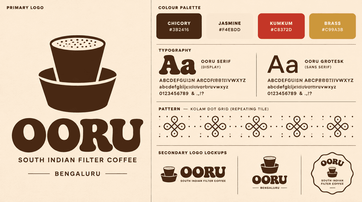
The davara-tumbler reduced to two shapes. Instantly South Indian, still legible at favicon size.
- Rounded, heavy wordmark
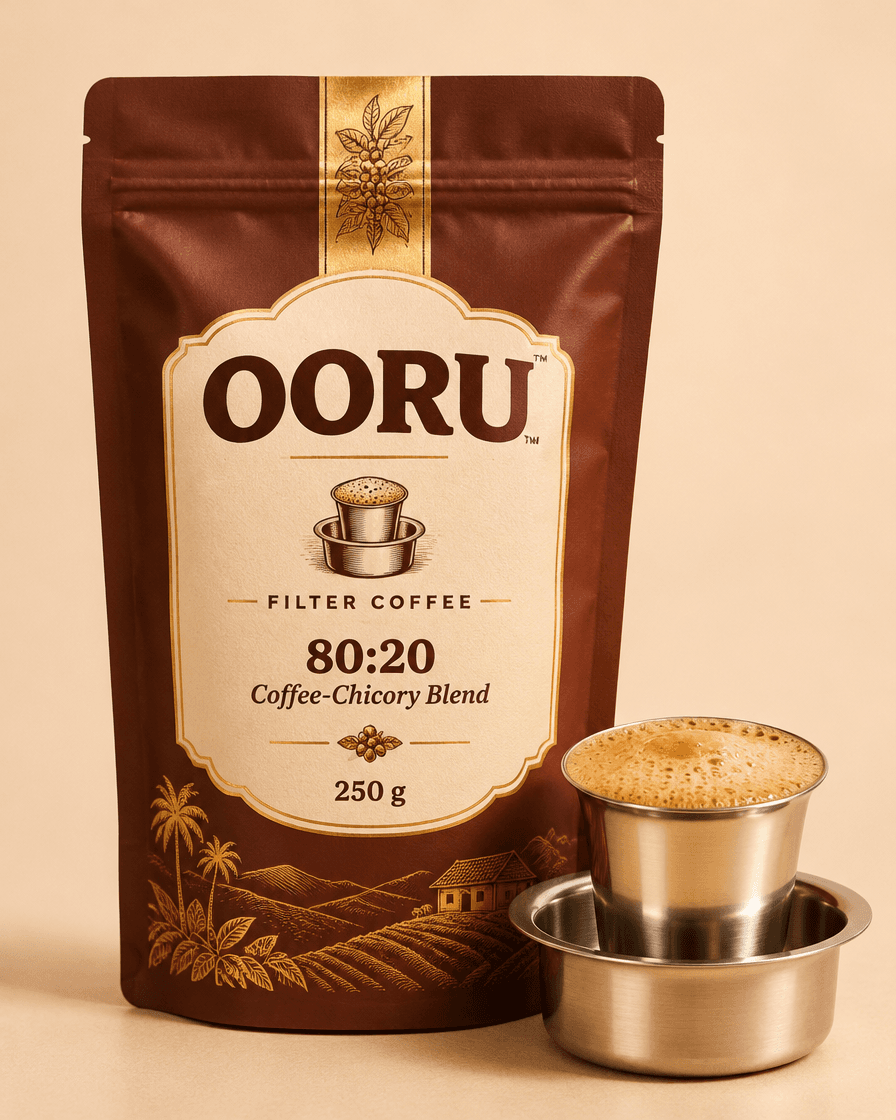
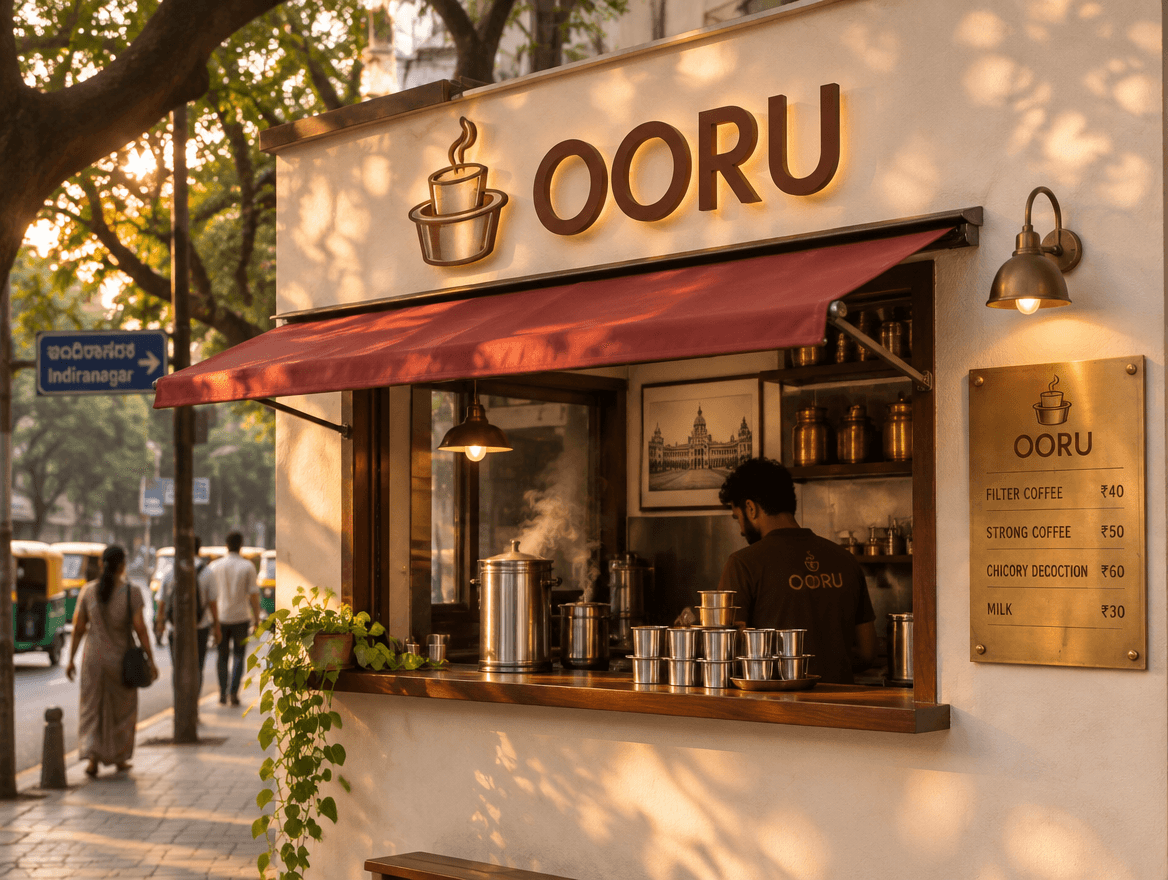
Soft corners echo pressed steel, and the weight holds up on kraft paper and sun-faded signage.
- A palette poured from the cup
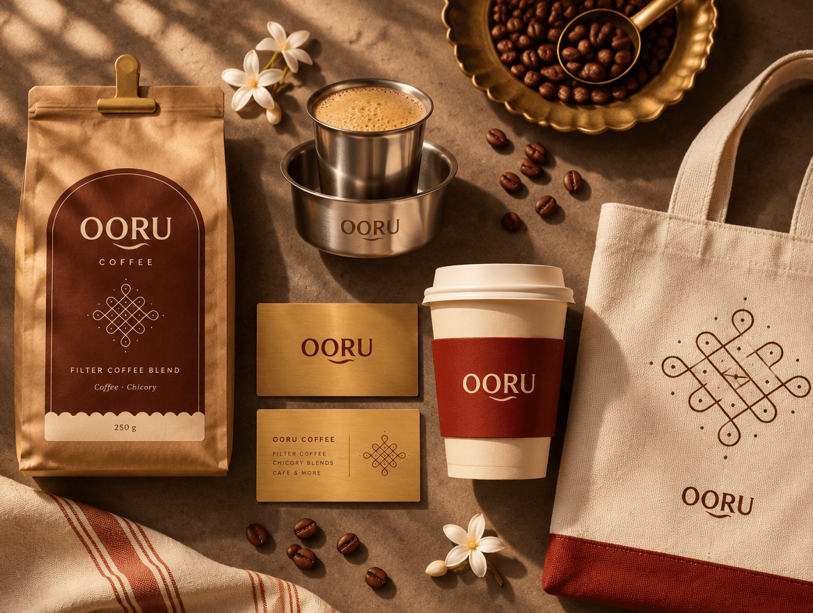
Chicory, jasmine, kumkum and brass: colours you find around a morning coffee.
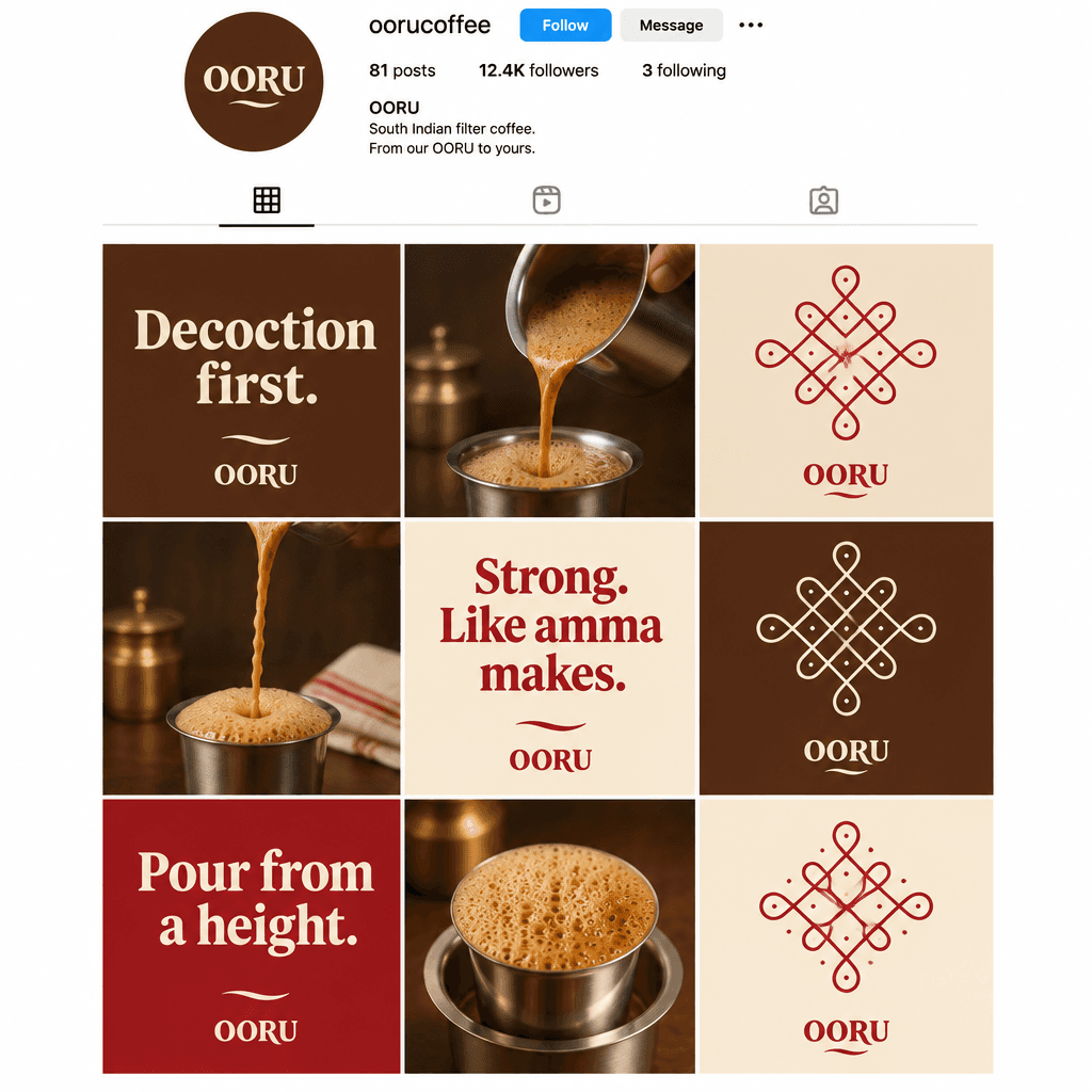
- Kolam dots as a pattern system
A flexible second graphic for bags, sleeves and social posts, so the logo never has to do all the work.
- A voice like amma
Short, warm and a little bossy: “Decoction first.” “Pour from a height.”
04What I’d measure
If Ooru launched, I would test recall of the tumbler symbol in unbranded tests, compare pouch conversion on the product page against the category, and watch how often customers borrow the brand voice in their own posts.
This is a self-initiated concept project. Ooru is a fictional brand I created to show how I think and work. The visuals were generated with GPT Image 2.0 (via Higgsfield) from my briefs and art direction.
Next concept →Thali Theory